Don’t underestimate the power of having a solid newsletter design. Email still remains one of the best ways to engage and convert customers. However, without a captivating newsletter, your email recipients won’t respond as well to your emails.
Here, we’ll go over all the newsletter designs and different newsletter layouts to give you some tips and examples on how to design a great newsletter for your business. Let’s jump right in!
What are email newsletters?
Email newsletters are meant to tell your audience about a specific event, promotion, sale, or bit of news. Newsletters can also be used to distribute new or important content, such as your latest articles, videos, or social media posts. Essentially, a newsletter is a form of communication between you and your audience, and there’s no limit to what you can include in it.
Unlike a casual email where you’d fire off a question or a quick note to your recipient, an email newsletter has a specific purpose.
Basic layouts for email newsletter design
There are basic newsletter layouts that go into making a professional newsletter. In general, a newsletter layout should consist of the following:
1. Organized your layout in a user-friendly pattern
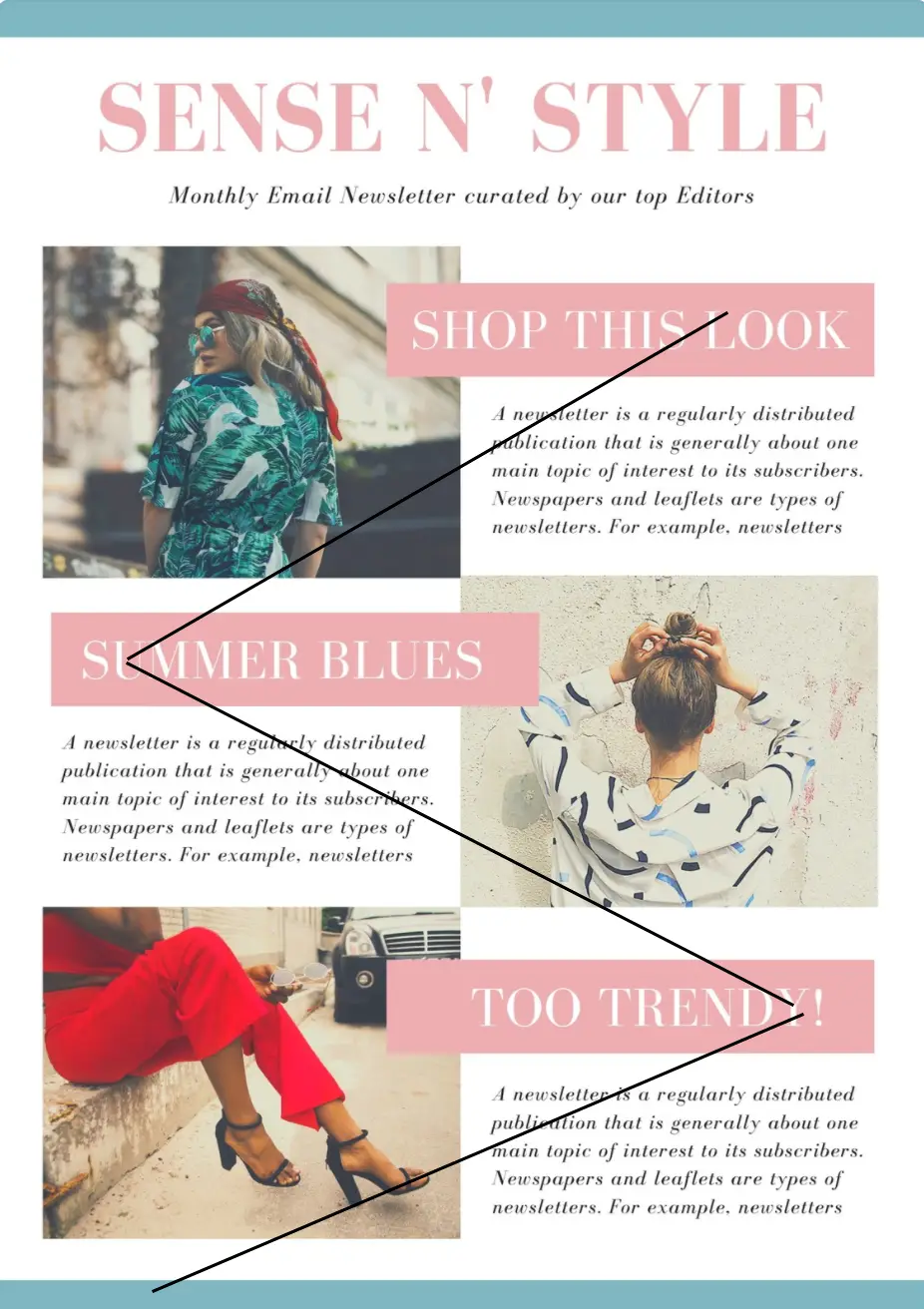
The idea is to lead your reader with a fluid pattern that the eye can follow.
For example: Below we have a Z pattern layout. The Z pattern trains a user’s eyes to go in a zigzag pattern. Meaning their eyes will go left to right and then top to bottom. This creates a fluent eye motion that feels intuitive for most people, and even pleasurable (kinda like looking at a tennis match with the ball going from side to side).
The Z pattern also allows splitting your newsletter into bite-size chunks that allow your readers to focus their attention on one item of content at a time. Essentially this makes your content look more accessible and more inviting.
The Z pattern gives your content room to breathe with white space. The images you set in the pattern also add attractiveness and additional context. Done right, a Z pattern layout ensures that you avoid engagement turnoffs like a “text wall of death”, or noise.
There are, of course, more UX design patterns that you can use, but the Z pattern is certainly the most appropriate for newsletters. Read our deep dive post on this subject if you want to get to know more UX design patterns.
2. Put your most important stuff first
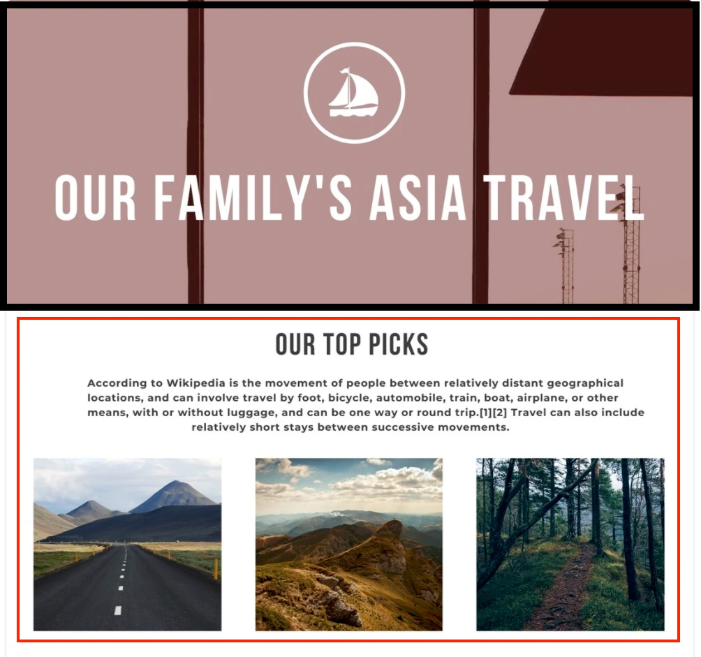
A trademark of effective newsletter design is to start with your highest quality and most important content. Simply add your featured content at the top, in a dedicated section right below the header.
This section should include the main message you want people to see, and your best quality content. Also, if you have some offer like a webinar signup, or a free resource to download, this is where you want to place the CTA button. According to statistics, that’s where people most likely going to click.
3. Lay your content around engaging graphics like images or videos
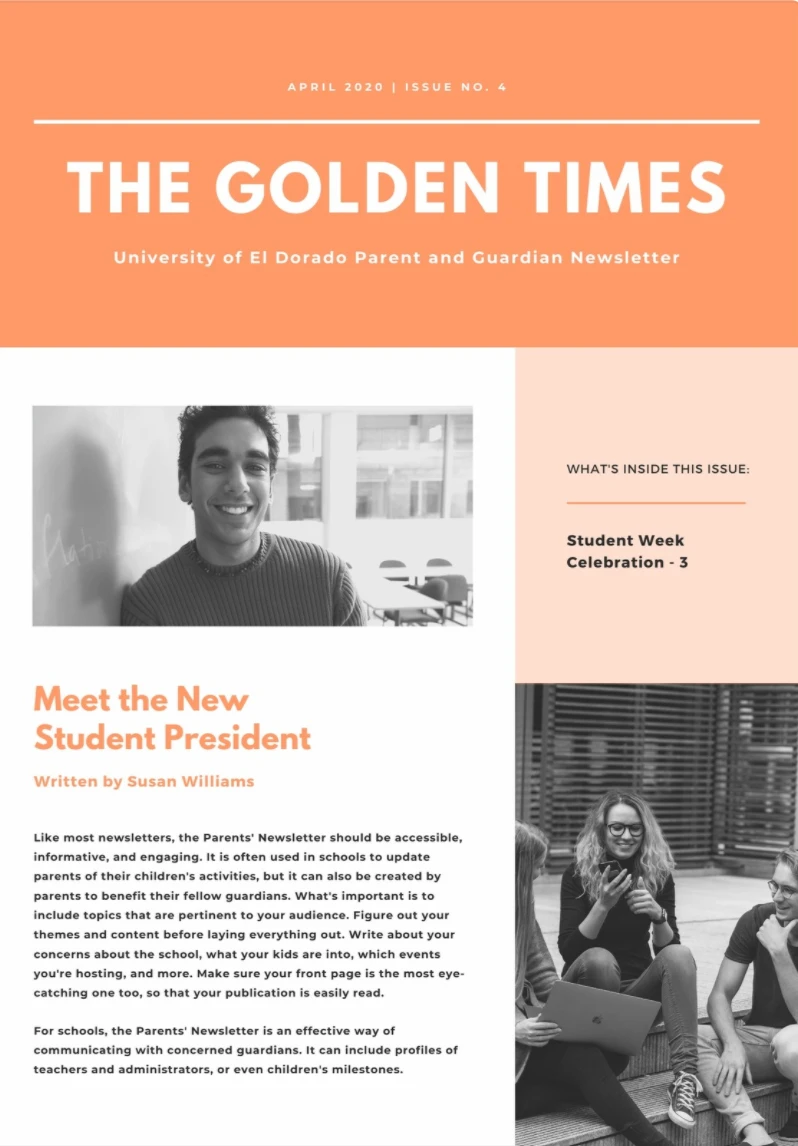
The content displayed in blocks with a mix of text and images. Text content should be kept to a minimum as to not be too overbearing. As you can see below there is a good balance between text and images.
4. Use clear CTAs like promotional text or buttons
In the example below, the first section under the header has a promotional button and a CTA to social channels. If you go to the end you can also see an unsubscribe option or plus other details for subscribers. This is very important since you don’t want to send your emails to other users who don’t want to receive them.

What is responsive newsletter design & why it’s super important?
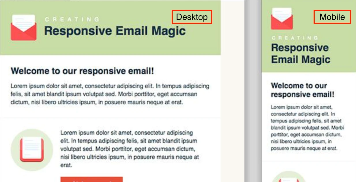
Responsive design is a newsletter design that is able to adapt to different screen sizes. So, whether your subscriber is opening your newsletter on a desktop, laptop, mobile phone, or tablet, they’ll be able to see the entire newsletter without any obstructions.
This is important since around 60% of emails are opened on mobile devices, yet we still default to creating newsletter templates for desktops. For example, create a template that is for both desktop and mobile.
How to create professional newsletters
There are a few things to keep in mind when building a professional newsletter. In general, you’ll want to map out the process in a few steps.
Step 1:
Decide on your newsletter’s goal, in other words, is your newsletter reckoned to gain leads? To grow your contact list? To generate traffic to your website? Understand your main priority and let that drive your newsletter.
Step 2:
Select the content you want in your newsletter, this is where you chose the type of content that will help you reach your goals. For example, if you want to:
e.g: Establish credibility: the best way is to provide content that makes you stand out from competitors, provide testimonials, and case studies.
e.g: Educate customers & provide value: offer valuable content that will help educate them, this can be articles on your blog.
Step 3:
Choose an app, software, or platform for distributing your newsletter. The top software for newsletters can be very pricey and may include features that will limit the overall newsletter design.
Step 4:
Create or customize a newsletter template, add all the content into your template, including links and personalization, must include CTA’s,
Step 5:
Test your newsletter and make sure everything including links & works properly. Do this by sending yourself a TEST newsletter. Play around with it and fix the broken links.
Step 6:
Ensure your newsletter is GDPR compliant, responsive, and displays correctly make sure your newsletter is legal with opt-in emails. A privacy law that passed in Europe in 2018, demands that email marketers can only send newsletters to those who have opted in to get them.
Step 7:
A/B test different versions of your newsletter come up with two different designs and send one template design to half the email list and the other template design to the other half. Later on, you can test to see which template worked the best.
Step 8:
Measure your success, analyze results, and re-adapt your future newsletters. Check the performance of your newsletter and refer back to the goal you established in section 1. Analyze which sections got the most clicks, and which sections contributed to your goal. Establish that and re-configure if needed.
General guidelines for newsletter design
The more thought you put into your newsletter, chances are the better it will perform. Therefore, it’s important to stick to some general guidelines when it comes to designing a newsletter.
- Make sure your newsletter design is focused on one specific thing, like a product update, promotion, piece of content, etc.
- Target the audience you’re going after with content and design. use personalization, segment your newsletter, and choose the content that you know your audience will love.
- Always stay true to your brand in terms of voice, tone, aesthetic, and what your audience expects. Meaning use the same font, colors, logos across all channels. This will keep the consistency of your brand’s digital appearance solid.
- Keep the layout and content simple instead of cramming too much in. The content type you want to include in your newsletter will determine the layout. A signal column layout is best used for a focused message. A multi-column layout is best used to prompt a variety of content.
- You don’t want to design a newsletter with 1000 different sections and images. Stay focused on one goal, for example, if you are sending out an educational email, only discuss educational tips.
- You don’t want to design a newsletter with 1000 different sections and images. Stay focused on one goal, for example, if you are sending out an educational email, only discuss educational tips.
- Make sure to use high-quality graphics. Choosing the right graphics has a large impact on the attractiveness of your newsletter and has a direct impact on the conversion rate.
- Make sure your logo is high quality
- If you are putting different graphics, make sure to use the same style and size.
- Tell a story in your newsletter to keep it interesting and engaging.
- Send out newsletters regularly to maintain expectations. On average it’s recommended to send out newsletters no more than twice a week but at least once a month.
- Check that your newsletter is easy to scan and view at a glance.
Common mistakes that lead to bad newsletter design
Aside from paying attention to general newsletter guidelines and best practices, it’s also crucial to ensure that your brand isn’t making these common newsletter design mistakes:
- Ignoring mobile and newsletter responsiveness and optimization
- Using fonts and colors that are difficult to read
- Adding in too many topics in one newsletter
- Not taking your target audience into consideration
- Sending newsletters with generic or boring subject lines
- Forgetting to add links or linking to the wrong pages
- Using the wrong or low-quality images
- Pushing too much promotional content
Basic components for email newsletter design
While the sky’s the limit when it comes to the content of your email, there are three main components of an email newsletter that should always be there.
Newsletter header design
The first part of your newsletter is the header, and it should be clean, bold, and recognizable. You’ll want to use your company’s logo in the header, along with a strong image. However, make sure that your header isn’t too cluttered since it’s the first thing recipients see in an email.
Header
Newsletter body design
The newsletter’s body can take on a lot of different forms, this is the meat of your email. This is where you can add in anything from more images, links, products you’re promoting, thumbnails and links to recently published content, a short text with a message you want to convey, and more. The design of your newsletter’s body will vary based on the content you want to use, which is why it’s important to plan out your content before settling on a design or a template.
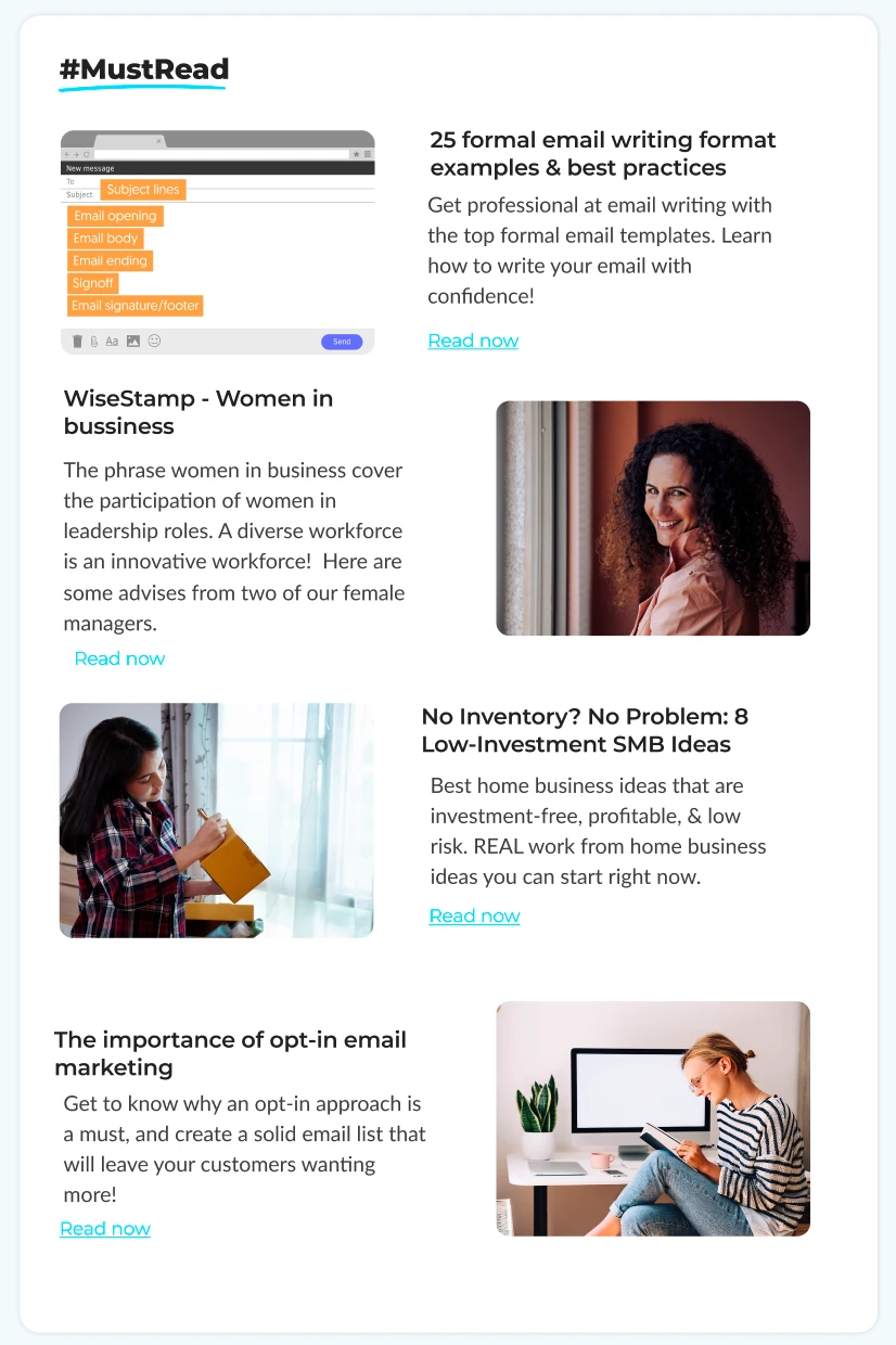
Newsletter body design
Newsletter footer design
Finally, the footer of your newsletter is where you want to put in things like an unsubscribe link or a link to the subscriber’s preferences, links to your social media pages or website, and your company’s contact details including location.
You can also include things to make your email stand out, like a personalized handwritten signature or even a CTA in your signature. Like the header, the footer shouldn’t be too cluttered; the bulk of the email should have been in the body.
Creating an email newsletter mockup
Instead of jumping straight into creating and distributing your newsletter, it can be helpful to create a mockup of what you want your design to look like. This mockup can be as detailed or as vague as you want it to be, but it’s a good way to ensure you don’t miss anything in your final design.
When designing a mockup, think of it as a draft. This is the stage when you should be thinking of who your newsletter is aimed at and what your goal is with it. You can play around with adding different content and placing images to see how they might look in the final version. You can create your mockup the old-fashioned way – on pen and paper or use an online program to play around with the design and move sections around as you see fit.
Creating the HTML for your newsletter design
While creating a newsletter can be as simple as choosing a template and plugging in the content you want, sometimes, it might be beneficial to use an HTML template. While it is a little more complicated, you can customize the template more to your liking and you’ll have more control over the design.
That being said, HTML does require some know-how and it’s not something you can do last minute if you’ve never worked with coding HTML emails before. But, once you learn the ropes, you might find you like working with HTML newsletter designs even better.
When it comes to designing your own HTML newsletters, you have a few options of programs you can use. Photoshop is one of the more popular ones, as well as Adobe, InDesign, and various different illustration software.
There are also a lot more details you need to pay attention to when designing HTML email newsletters, such as ALT text, title tags, the structure as well as the width of your message, tables, CSS files, and much more. If you want the benefits of an HTML-designed newsletter but don’t want the headache, consider hiring a programmer to help you out.
Best tools for email newsletter design
There are plenty of free and paid tools out there that can help you build beautiful email newsletters in just a few minutes. Here are a few of the design tools we recommend.
1. Photoshop
Price: $20.99/month
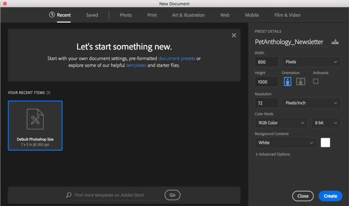
Photoshop is an all-around editing and design tool that can help you create customized email newsletter designs. Photoshop also allows you to import third-party templates that you download or purchase online and customize them to your liking. You can create and export HTML email newsletters and add, create different sections of your email, and add things like images, text, and social links.
2. Canva
Price: free, $11.99/year for Pro Plan, or $30.00/month/person for Enterprise Plan
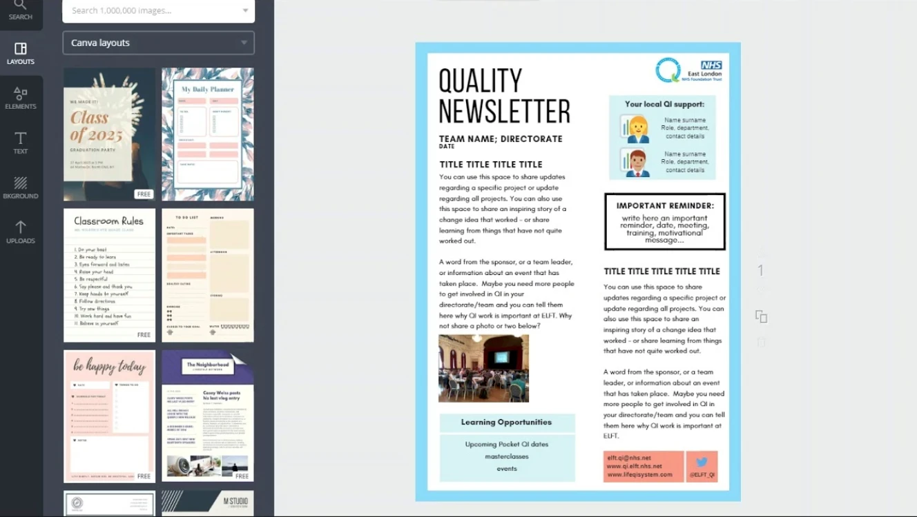
Canva is a great online design tool that allows you to create a variety of different graphic design objects from digital invitations to CVs and more. Canva comes preloaded with tons of free and paid templates that you can build your newsletter. You can select fonts, customize colors, add graphics like icons, images, vectors, and borders, and then download your design when you’re happy with it.
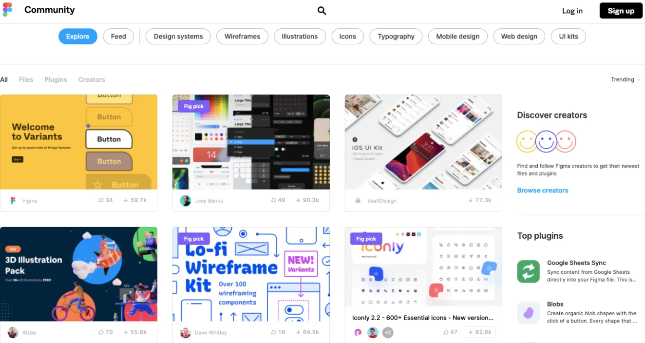
3. Figma
Price: Free, $12/month/person for Professional Plan, or $45/month/person for Organization Plan
With Figma, you can download and use tons of different files that users have uploaded to the platform. It’s essentially an online collaborative community where you have access to many different design and interface downloads.
You can opt to search for downloadable newsletter templates, or even just search for specific elements to download, like buttons or vectors. Once you download the design, you can access the file and customize it.
4. Visme
Price: Free, $15/month for Standard Plan, $29/month/user for Business Plan, custom pricing for Enterprise Plan
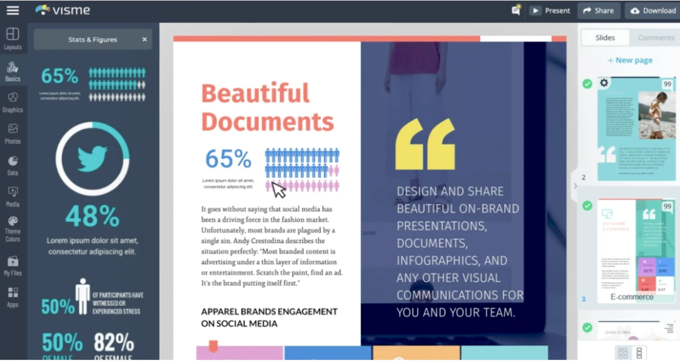
Visme allows you to create customized visual business tools, such as presentations, infographics, and more. There are plenty of useable newsletter templates on Visme that you can select and customize to your preferences.
Visme is simple to use and allows you to easily move elements around in your design and add things like images, vectors, charts and tables, quotes, text boxes, and more.
11 top newsletter design templates
Now that you have a better idea of what goes into a newsletter as well as some design tools you can use, let’s take a closer look at some great templates to choose from. We’ve broken it down into different scenarios so that you can get a taste of different designs and layouts that will help you find inspiration for your own newsletter.
1. Cool newsletter design
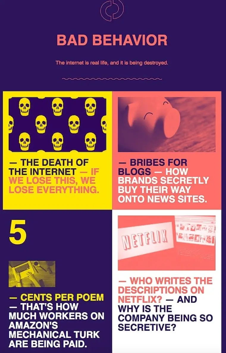
When you choose your design, sometimes you want to go for something that’s immediately eye-catching to get the reader to stay on your email or click on something. This email from The Outline uses bold and juxtaposing colors and text to grab attention. The design isn’t too cramped and a reader’s eyes are guided through the different headers that make them want to click and read more.
2. Modern newsletter template
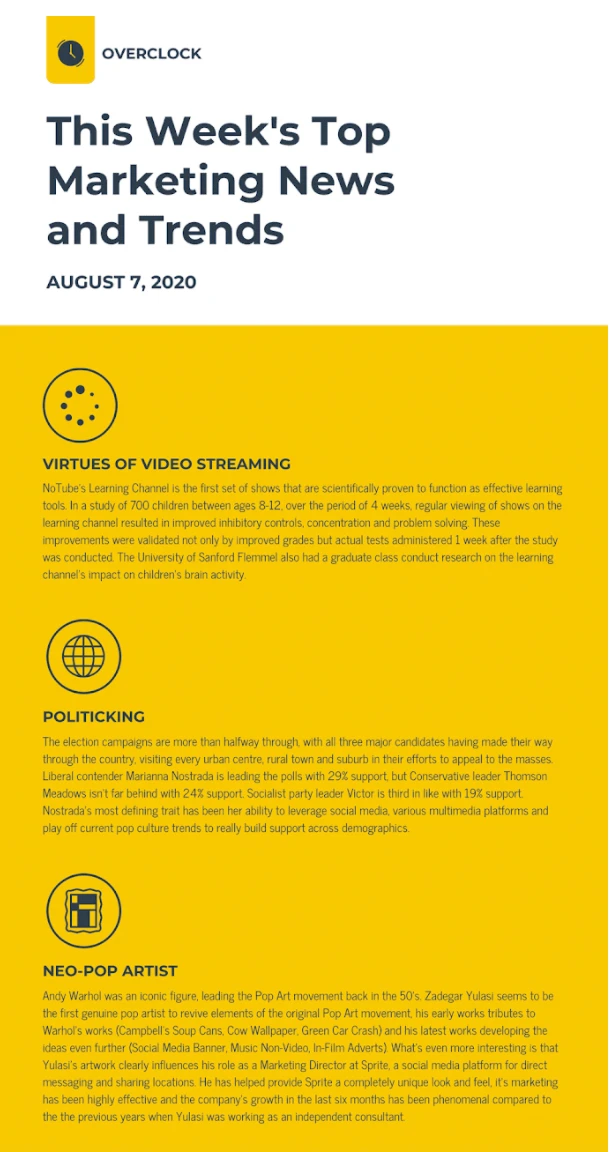
This email newsletter uses a simple modern design but still attracts attention. By using a neat color scheme, implementing cohesive icons, and using easy-to-read text, this newsletter is effective at getting its message across. You’ll also notice that there’s a simple header the company logo and the title of the newsletter. Nothing too complicated here.
3. Creative newsletter template
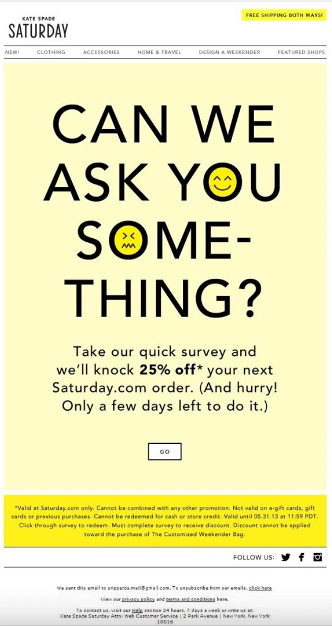
This newsletter from Kate Spade breaks the traditional mold of emails that use a classic body section filled with content like images, text, and promotional items. Instead, this newsletter goes for a bold header and a CTA asking users to click a button and complete an action. This creative newsletter shows that you don’t always need to stick to a predetermined template when designing a newsletter for a very specific reason.
4. Beautiful newsletter design
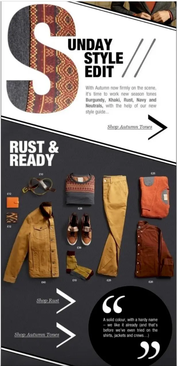
This email newsletter from Edited is especially stylish and encourages the eye to follow a natural path from the top to the bottom of the email. The bold ‘S’ at the start of the newsletter catches your eye, and then the design uses high-quality images that promote certain products followed by specific links to various clothing collections. It’s both simple and intricate and works really well.
5. Corporate newsletter
Just because an email is corporate doesn’t mean it has to be boring. Checking out this corporate company memo from Skyline Consultants informing its employees of updates and new procedures. This is a great way to send a corporate memo aside from just plain text since it’s more visually appealing therefore employees are more likely to retain the information.
6. Company newsletter design
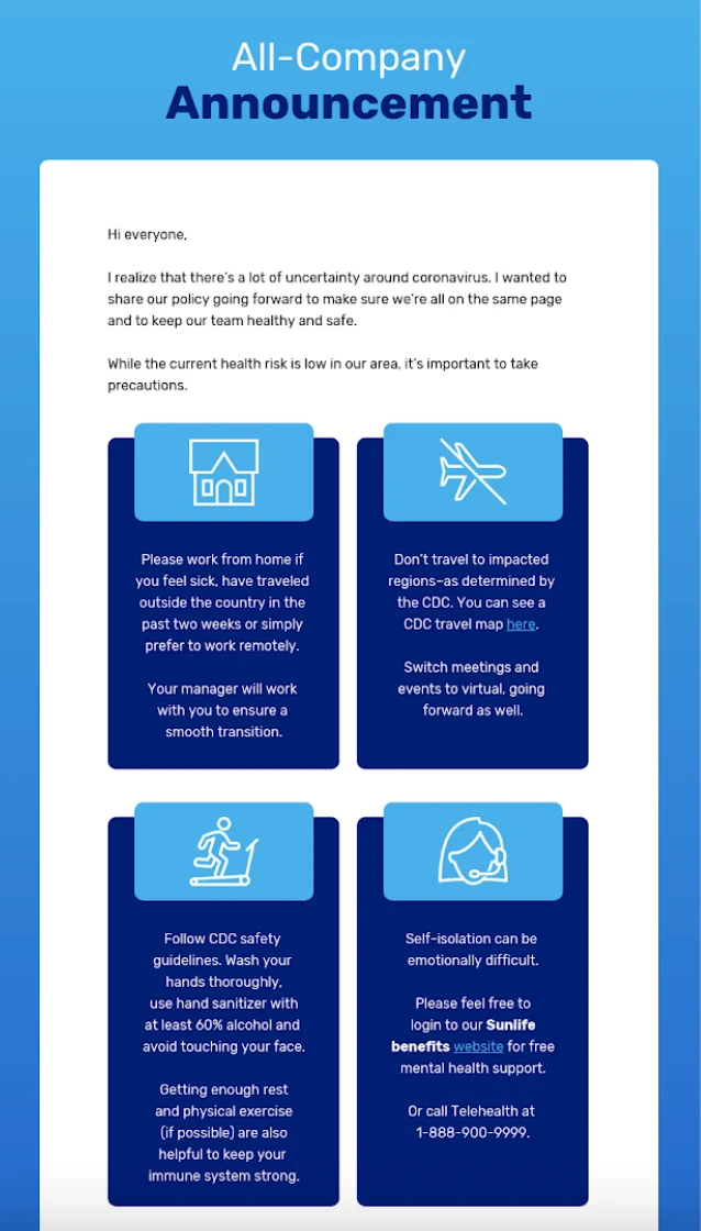
Company newsletters can be just as visually engaging as promotional emails you get from brands. Here, Venngage uses a mix of icons and text with a very distinct layout to convey its message. The layout naturally makes a reader’s eye go back and forth across the page, so this is a great design to use if you have a lot of text.
7. Minimal newsletter design
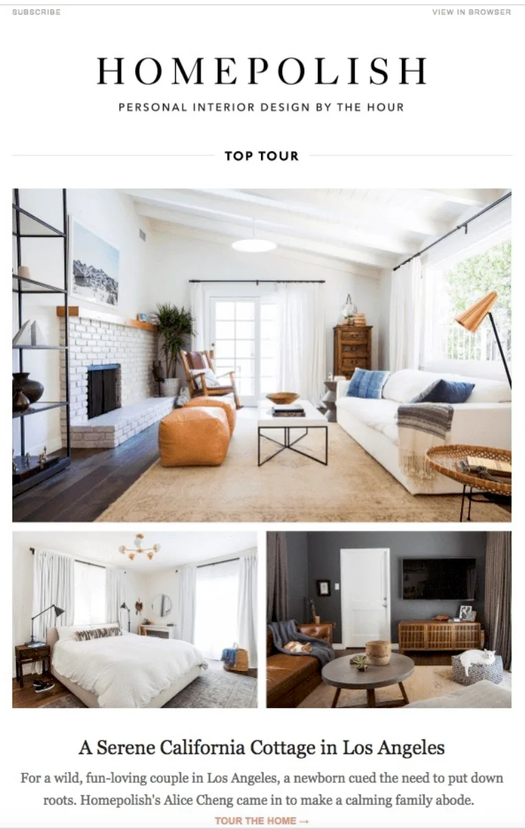
Sometimes, less is more. That’s the theory that Homepolish went with on its newsletter. By using bold and beautiful images with just a few lines of text, the newsletter has a stunning impact. This is a great type of email template to use if you really want to showcase high-quality images or visual content.
8. Simple newsletter design
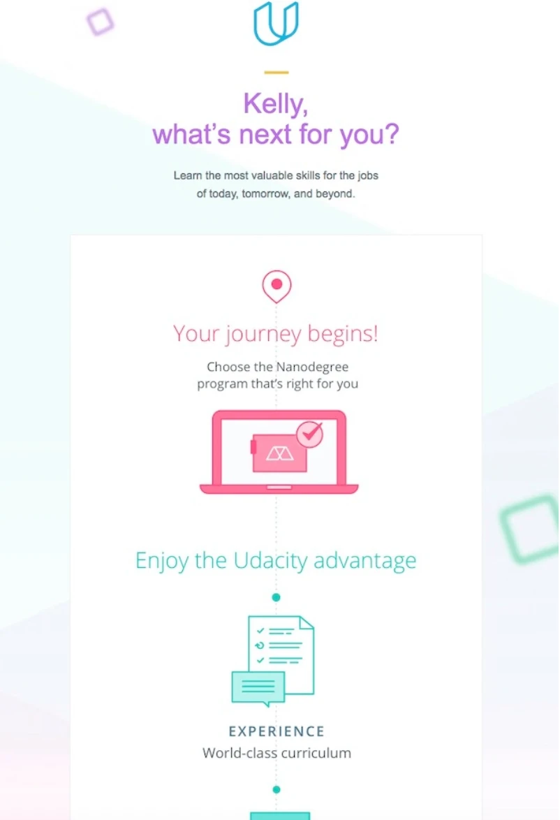
As we saw before with the minimalist design, you don’t need to cram a lot into each newsletter for it to be effective or to get the results you want. This email newsletter from Udacity uses a simple and straightforward design with muted colors and basic graphics to make their message clear to the recipient. It also personalized the email with the subscriber’s name, which is a great extra touch.
9. Clean newsletter design
We’ve seen quite a few email newsletter layouts with bold and eye-catching colors and designs, but you don’t always need to go that route. This clean email from Prettify Home uses a basic color scheme, one simple image, and an easily-scannable block of text in its newsletter. It’s visually appealing but doesn’t include any type of frills in order to get its message across.
10. Business newsletter design
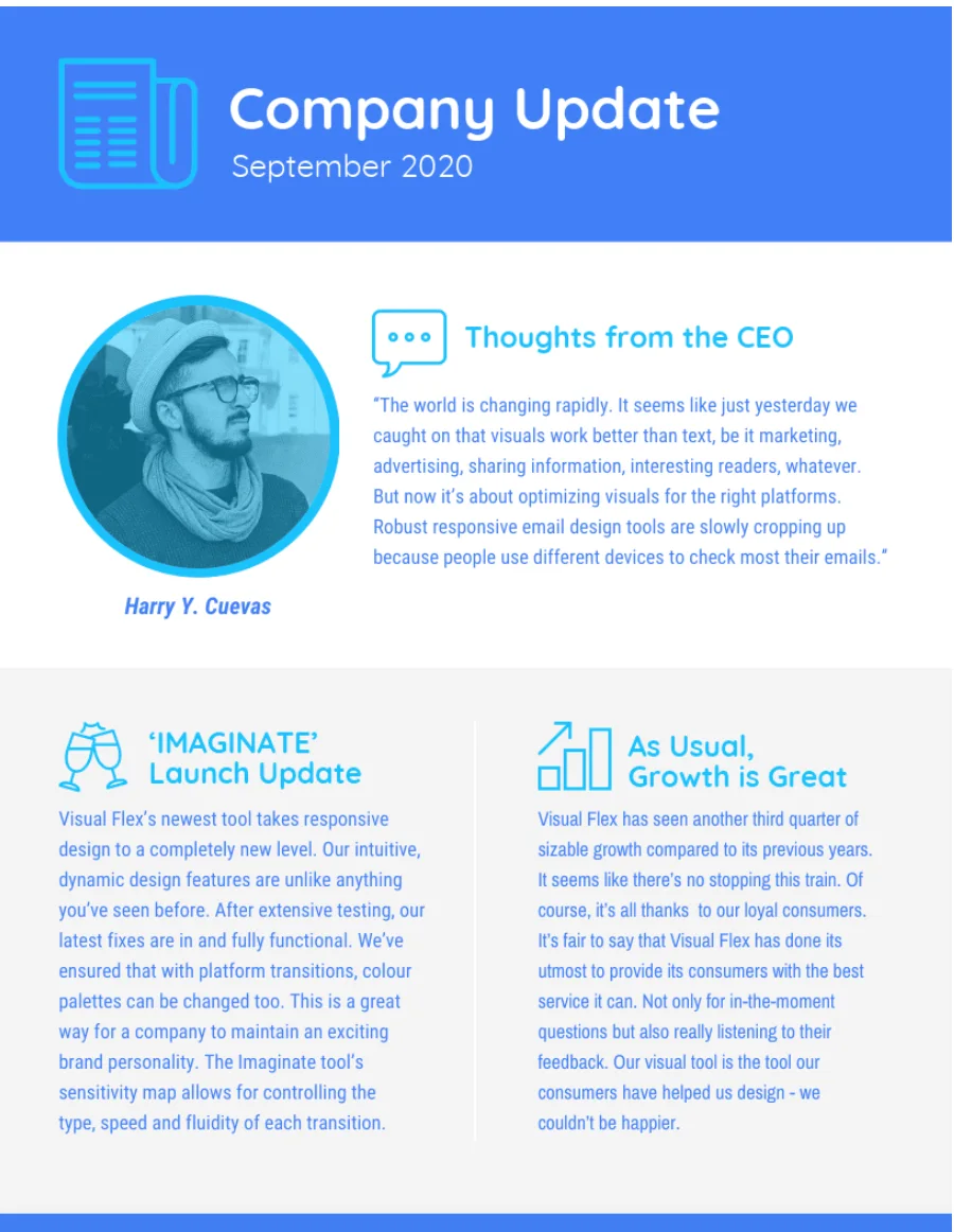
Here’s another example of a business email from a CEO that sent a communication to company employees. You’ll notice that the colors here are very cohesive, from the text to the icons and even the border. This helps the entire newsletter blend together really well and even though the blue used here is relatively bright, it’s not overbearing.
11. Monthly newsletter design
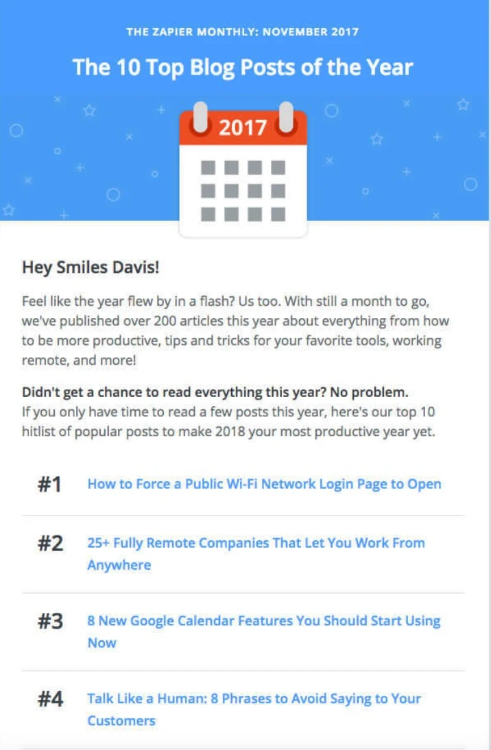
This monthly newsletter from Zapier uses a pretty simple design but effectively gets across all the updates from the last month. There’s a header with the company logo followed by a title that tells the reader what to expect in the email. By gathering all the top posts over the last month, the company has made it easy for their subscribers to stay up to speed on the latest news and posts.
To end things
The success of your newsletter depends on both the content but also the design which can be technical as well. Focusing on the user experience and how it will influencer engage with your newsletter. Thinking about if the user will need to scroll, the sizing of the newsletter including images if there is too much text or too many images. Thinking about the bigger picture.
The post 11 best newsletter design templates & layouts (2023) appeared first on WiseStamp.
